LAPALMA AT SALONE DEL MOBILE 2026 || When Colour Stops Being a Finish and Becomes a Framework
At most trade fairs, colour is the last decision. At Lapalma's Colour Landscapes exhibition at Salone del Mobile 2026, it was the first.
That distinction matters more than it sounds. For the Italian furniture brand, colour has historically functioned as most manufacturers treat it: a palette of options applied at the end of a design process, once form and material have already been resolved. Colour Landscapes proposes something different. Developed in collaboration with architect and designer Raffaella Mangiarotti, the exhibition presents colour as a structural design tool, one capable of shaping identity, driving spatial narrative, and unifying a catalogue across vastly different use contexts.
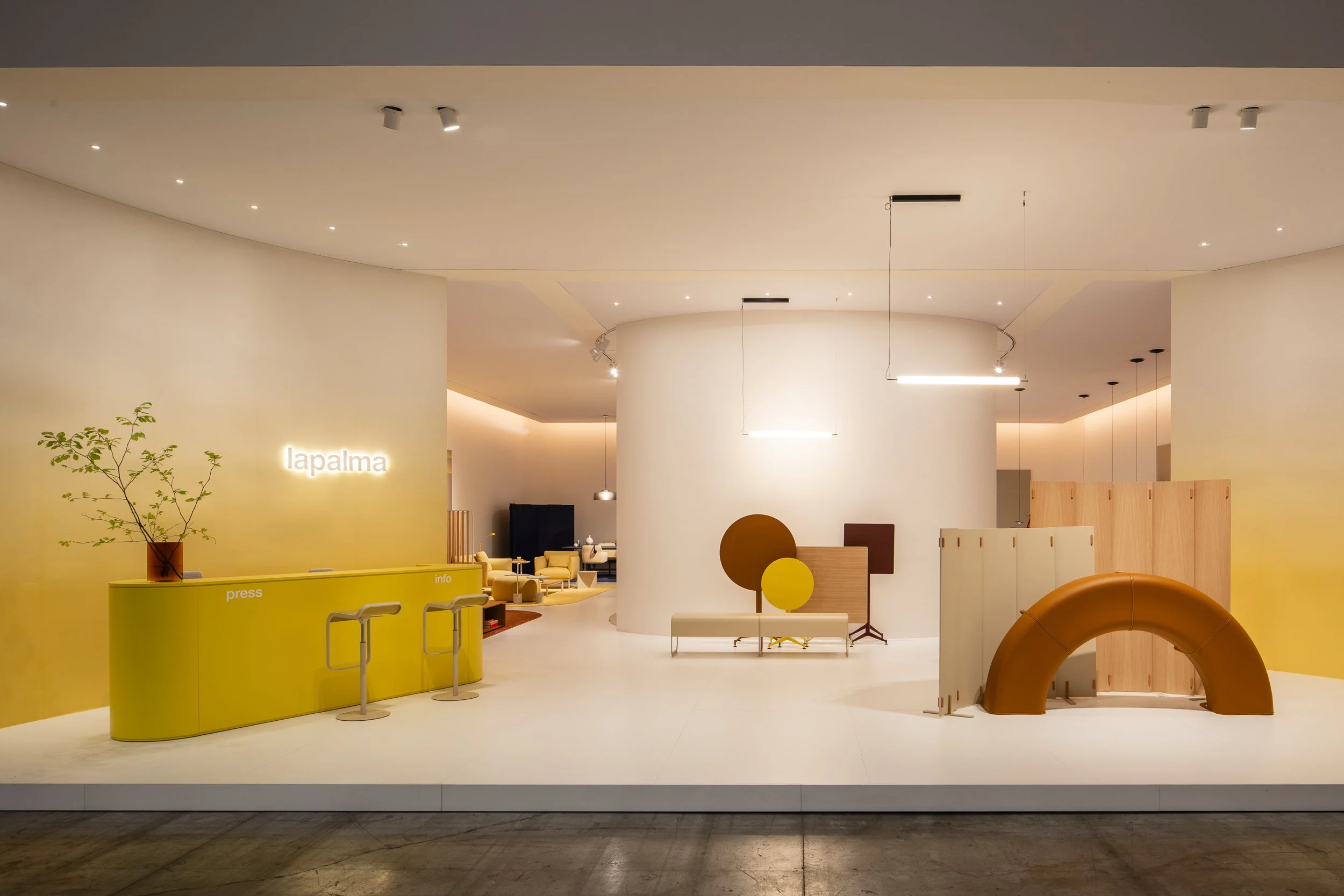
Lapalma's entrance environment at Salone del Mobile 2026 uses lemon, amber, and white tones to establish colour as the primary spatial experience before a single product is introduced.
The methodology behind the project is worth understanding. Mangiarotti began not with a trend forecast or a colour theory exercise, but with Lapalma's own visual archive: catalogues, advertising materials, and historical references accumulated over more than four decades. From that material, she identified a selection of tones that carried genuine brand equity, then reanalyzed and recontextualized them for contemporary application. The result is Lapalma's New Colour System, a coherent chromatic framework built from the inside out.
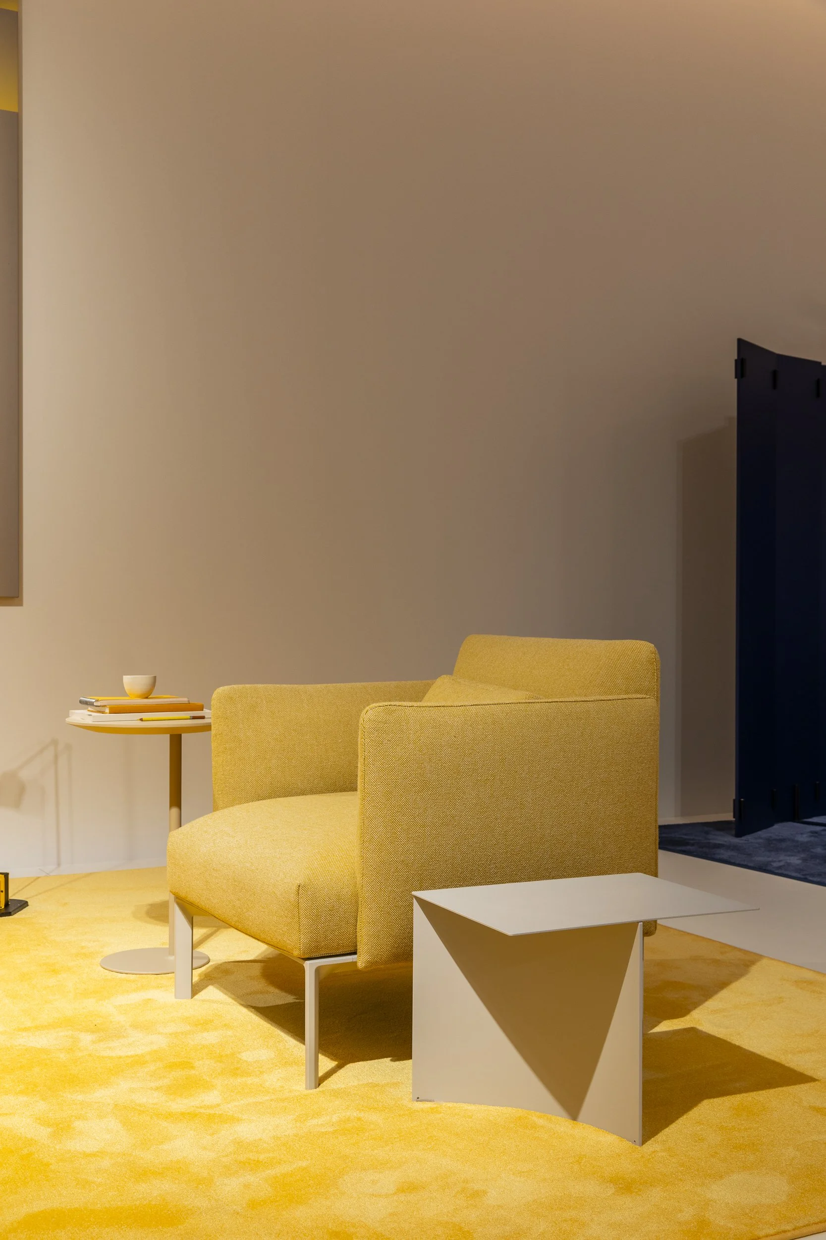
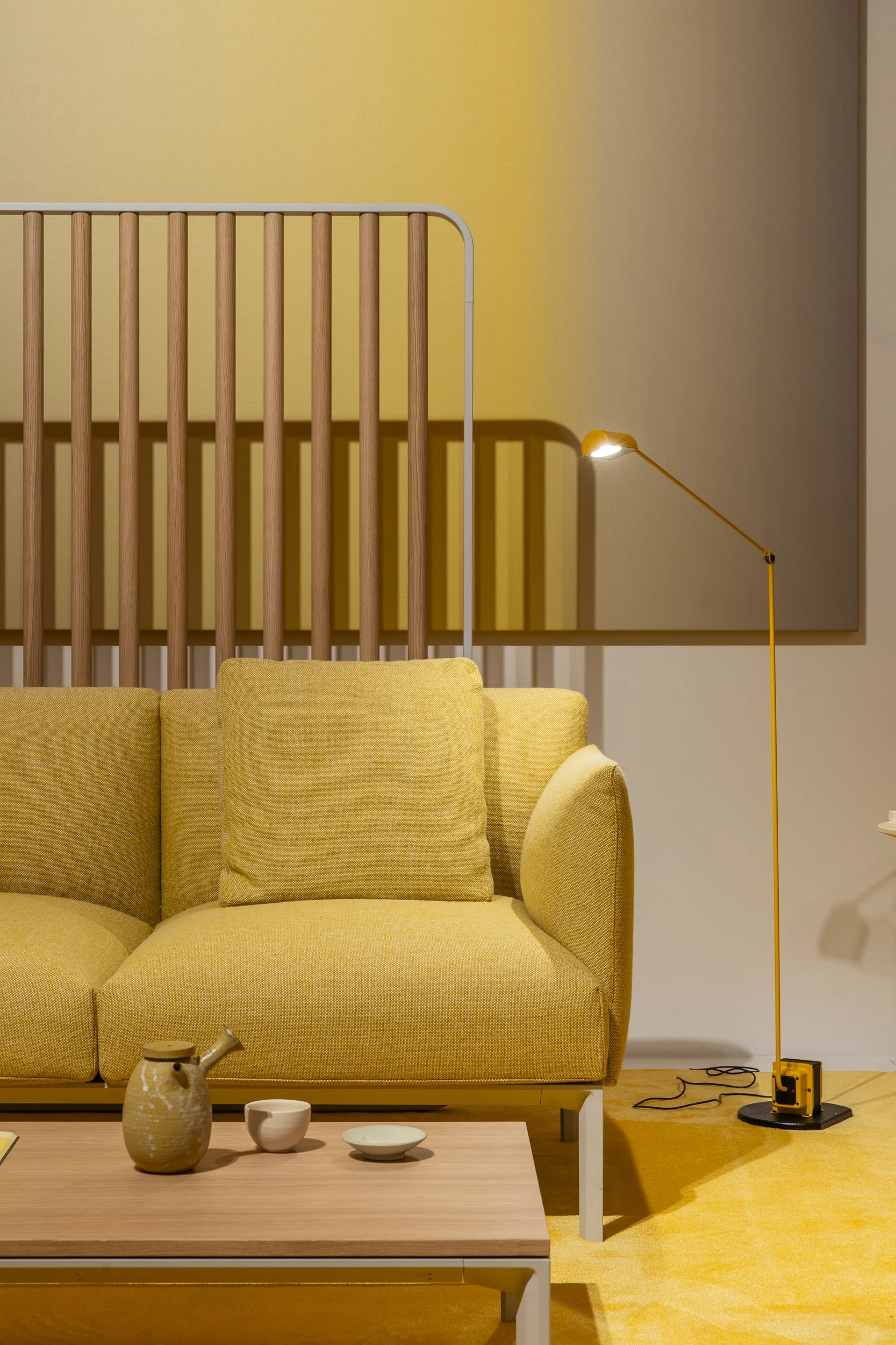
The central lounge environment layers cream, mustard, and deep burgundy across seating, textiles, and cabinetry to demonstrate the New Colour System's coherence across a full contract setting.
What visitors encounter at the Salone is that system made spatial. Six environments structure the exhibition, each representing a design context Lapalma knows well: waiting areas, office spaces, co-working zones, café settings, and lounge configurations. Across all of them, colour functions as an organizing principle rather than decoration. It defines zones, establishes atmosphere, and makes legible the relationships between furniture pieces that might otherwise read as a disconnected product lineup. Sometimes the palette works through contrast; elsewhere it operates in solid chromatic blocks. In both cases, it does the work that architecture usually does.
The lapalma Café installation, conceived with Ligre, uses a monolithic burgundy counter and tone-matched barstools to show colour's capacity to build an entire functional environment from a single hue.
In the office zone, deep navy surfaces and a curved indigo screen create a chromatic boundary that defines the workspace without the need for walls.
At the exhibition's centre, a Colour Lounge translates this thinking into something tactile. Material and surface samples allow close examination of how Lapalma applies its colour system across different substrates: how a tone behaves in oak versus lacquered metal, in textile versus leather. Colour matching, in this context, becomes a technical argument as much as an aesthetic one.
Two new product introductions round out the presentation. The KILI table family, designed by Mario Ferrarini, explores the tension between sculptural presence and lightness through a process rooted in plate-turning craft. The ADD Lounge collection from Francesco Rota, comprising an armchair and two- and three-seater sofas, is aimed squarely at contract designers; the pieces are compact without being compromised, prioritizing function and spatial efficiency alongside comfort.
What Colour Landscapes ultimately demonstrates is a disciplined argument for restraint. In a fair environment defined by volume, Lapalma chose to do one thing and do it thoroughly. That kind of focus is its own design statement.
Photography by Federico Marin