JESS || Box-in-Box Design with Geometric Patterns and Colour

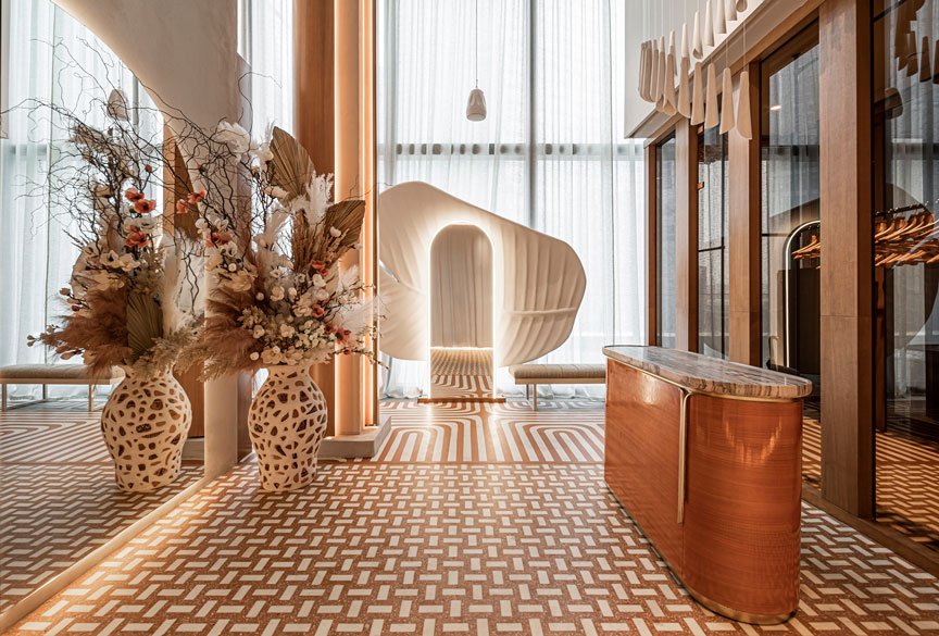
Jess, a restaurant in Romania designed by biancoebianca studio, showcases a dramatic and sophisticated box-in-box effect, where three distinct spaces serves up a unique experience with each visit.
Founded in 2017, biancoebianca is an architecture studio based in Romania offering interiors, graphics and product design services. Founded by Elie Kamel (Lebanese interior architect) and Timeea Bianca Diosi (Romanian designer), the duo follows a simple but strong concept, where the world needs more functionality than beauty. The basis of their designs focus on creating a comfortable and functional space, after which they contemplate the style of design.
The half moon mirror on the wall is a symbol of biancoebianca studio.
For Jess, the project scope was all-encompassing, where the biancoebianca team handled aspects including concept, branding, naming, interiors, furniture design, execution design and implementation, kitchen design, and equipment configuration. Essentially, the entire guest experience of the space was entrusted to them.
The resulting space saw three unique pop-up spaces defined by the use of bold colours, materials, and geometric shapes. Throughout the three bright, contrasting spaces, the use of a strong geometric symbol in each space unifies the design; the half-moon shape makes an appearance in each of the three defined areas, whether in the shape of a cushion, mirror, kitchen window or wall pattern.
The biancoebianca team began their design exercise with choosing one colour for each space, and then layered on top of this parameter, they began to add different shades of the same colour in different materials, textures and patterns, creating a bold sensory experience that at first glance seems bubbly and childish, but upon further inspection and understanding of the design concept, reveals the meticulous efforts undertaken by the team to create depth in the interior design.
Beyond the complementary selection of colour, materials and patterns, the team then thoughtfully added the use of various lighting techniques as a finishing touch for the overall interior experience. An airy bright space in the lounge area decorated with plush, pink velvet chairs, where the ceiling is also in a lighter shade to facilitate the spread of light across the room.
In this brightly-lit area, the menu is playfully arranged with alphabet tiles whimsically arranged on thin golden slits. Three shades of blue create a powerful geometric pattern on the wall, and this colour combination is repeated both along the other sides of the wall and mirrored in the arrangement of the furniture. Neon signage for the words ‘turn me on’ adds a playful touch to complete one side of the room.
Even the drink cart in a bright blue hue has been designed to align with the curves highlighted in this lighter space, with rounded edges at each point and a whimsical circular wheel balancing the cart’s weight.
The colour combination repeated and mirrored in the furniture.
The middle section of the restaurant transitions between the bright and airy light blue cafe and lounge area to the energetic red and orange dining space on the far end of the restaurant. Here we see the use of a customized resin terrazzo pattern that is the anchoring design element of Jess, which was designed and made piece by piece by the designers mixing some materials , like acrylic resin. Similar to the light blue area, the same shade is overused throughout the section, on table tops , backrests , bar door details , and the bar counter.
A deep orange is used for the seating lining the wall, an impactful side of the room where all the design elements come together, with the custom resin terrazzo, half-moon mirror, contrasting light blue and vibrant orange, along with the use of velvet for the seats.
The team’s efforts to thoroughly consider every detail in the space are evident in their consideration of details such as how the ceiling in this section utilizes a pattern and material that is reflected in the bar. At the footer of the bar, we also see the repetition of the half-moon pattern, this time in a golden hue paired with a golden leg rest that runs along the length of the bar.
Seats lining the wall hinting at the magical number of 7 seats.
Whereas the connection between the cafe, lounge and bar area is more gradual, the last dining space takes a bold turn, with the lighting also switching entirely to a warm, energetic red. The tables are arranged with seating for two, which along with the warmer and dimmer lighting in space fosters more intimacy and conversation.
The half-moon symbol is again repeated in this area, with the kitchen serving window taking on the same shape and an impactful semi-circle prominently integrated into the bathroom entrance. The staggered steps design of the shelving in this area is a mirrored reflection of the staircase design on the opposing end of the restaurant, a subtle use of geometry to balance the overall interior design. In addition, a neon sign placed over the kitchen serving window mirrors the ‘turn me on’ on the far end of the dining space.
Not only has the biancoebianca team created three distinct spaces that are unified through materials, geometric patterns and symmetry, the team has also presented a process of maturation in the design, from the bubbly bright space to the dim, intimate dining area, which the team describes as ‘having a more simple approach, with a twist of colours and bold lines’.
Jess’ interior design approach aligns with the biancoebianca team’s design philosophy, which is to begin with the functionality of the space as the core element and decide the purpose of each space and then add stylistic elements on top of the fundamental purpose. The resulting dramatic, box-in-box pop-up effect of the unique spaces highlight the vision and creative prowess of this duo, and we eagerly await future creations from the innovative duo.
Photo Credit: Raul Jichici