BRIGHTON STREET EARLY LEARNING CENTRE || A Nurturing and Stimulating Space in Melbourne
With children around the world heading back to the classrooms this week, what better time to be inspired by a bright and welcoming learning space such as this one by Interior Designer Danielle Brustman in collaboration with Architects Perkins Architects and carpentry experts I BUILD M?
Brustman was engaged to design the interiors of a repurposed a Brutalist building that was being converted into an early education centre in the inner city Melbourne in the suburb of Cremorne. While she regularly uses bright colours in her work, Brustman shares that this project provided an ideal environment where she could treat each wall, bench surface and material with a range of colour blends of varying hue and material. In total, 47 interior paint colours were used to create this refreshing learning space.
Unique shapes and forms encourage children to develop their creativity
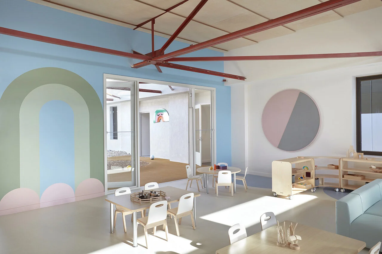
Brighton Street Early Learning Centre greets parents and students with soothing colour pairings on the walls and playful motifs designated to each of the rooms in the learning centre. Uniquely-shaped diagonal pink tiles next to the reception area break from traditional square tiles, instilling creativity in the centre’s young visitors.
In contrast to the colourful designs, parts of the original interior concrete bones of the brutalist building have been left exposed to create an intersection and juxtaposition between the original raw building elements and the softer, more colourful material surfaces.
Each room showcases a unique theme based on the 4 seasons
Each of the rooms bears a unique theme and been allocated a motif; these included river, lake, meadow, forest, star, sun, and cloud motifs. Seasonal references are used throughout the spaces; the forest and river rooms have an autumnal feel to them while the cloud and sun rooms have a more summery palette and atmosphere.
There are several hand-painted graphic mural walls by Ben Maitland that relates to the themes and are made up of blocks shapes, square, triangles, and circles that created boats, starbursts, clouds, rainbows, waves, and trees. These murals help children see the connection between complex and simple shapes.
Hand-painted soothing colour rainbows adorn the walls
Round tables in the learning spaces foster social interaction in small pods, encouraging children to share their colourful drawings and creations with each other. Bold patterns can be found on walls, wall columns and even in the carpet depicting complementary hues, training the eyes to identify pleasant colour combinations from a young age.
“Children are so imaginative and less inhibited than we adults. It made complete sense to me that these spaces ought be filled with both stimulating and inspiring visuals. ”
Bathroom tiles display another nonconforming design, with square tiles arranged in a mesmerizing gradient of blue and green shades. Each room is given its distinct character with a unique colour profile, adding a fun layer to how young children can use to tell different spaces apart.
Mesmerizing blue and green shades in the bathroom
Pink and purple tile combination in another bathroom
“Colours and materials that are often used in education can be a bit crude and institutional. I wanted to completely break away from that model and present child-friendly spaces that felt more personalized and fun to be in.”
Bold patterns can be found on the walls, carpets and even wall columns and pillars
Staircases incorporate safety precautions such as railings available to children at varying heights
In addition to create a nurturing and stimulating environmemnt for the children, Brustman focused on using natural and durable materials as an integral part of the interior design. Marmoleum, a natural blend product is used on the floors throughout the centre. The Marmoleum is made up of 70% natural fibre and 40% recycled materials. Customized rugs were designed for each of the play spaces to align with the room schemes. The patterned Tretford rugs are made from 100% goat hair. For the learning centre’s lighting fixtures, Brustman invited local Mmelbourne-based lighting designer Copper ID to create feature-coloured pendants for the reception area and stairwell from the Flask range made of toughened glass traditionally used for manufacturing Science beakers.
Feature pendant lights made from toughened glass used for science beakers
Another key consideration was noise and sound travel. Groups of children in a play space could make a lot of noise, so Brustman foresaw this acoustics issue and outfitted floating acoustic ceilings and used soft wool and vinyl furnishings to minimize the impact of loud echoes and sound bouncing off hard surfaces.
Brighton Street Early Learning Centre sets a new standard for how early education centres can create a space that is at once soothing and inspiring for children. With thoughtfully considered play rooms and a cohesive flow throughout the space, it provides an optimized learning environment to encourage children to develop the foundational skills needed for a brighter future.
Interior Designer Danielle Brustman
PROJECT DETAILS
Interior Design – Danielle Brustman @daniellebrustman
Architecture – Perkins Architects @perkins_archiects
Builder – I BUILD M @ibuildm
Murals painted by Ben Maitland @boxcarbenny
Photographer – Sean Fennessey @seanfennessey
Styling - Danielle Brustman