COLOUR AS IDENTITY || A Brazilian Apartment Defined by Material, Tone, and Modernist Warmth
Colour doesn’t decorate this apartment; it defines it.
Designed by Küster Brizola Arquitetos, this 150-square-metre apartment in Curitiba demonstrates how colour, materiality, and texture can operate as architectural language rather than surface embellishment. The result is a home that feels expressive yet controlled, where each tonal decision contributes to spatial clarity and everyday comfort.
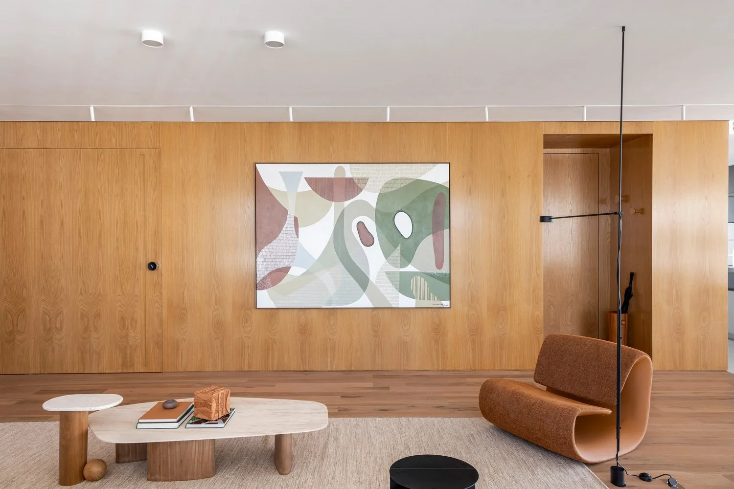
The living room uses colour as a backdrop rather than a focal point, allowing furniture, artwork, and material textures to take precedence.
Full-height wood cabinetry that anchors the space and maintains continuity with the adjoining social areas.
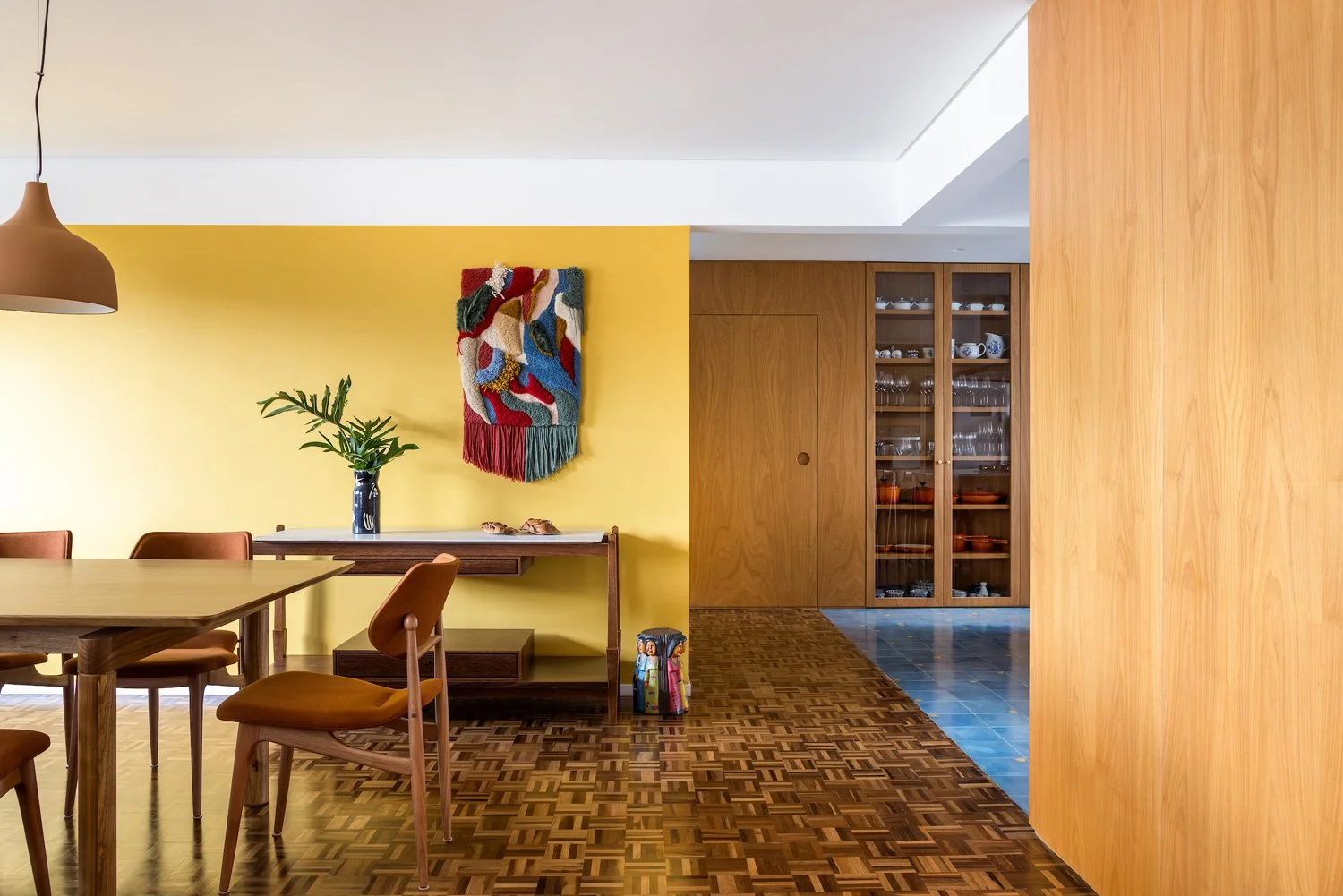
The social areas are organized as a single, fluid environment, integrating the living room, dining area, and kitchen into a continuous space designed for gathering. Here, the restoration of the original wooden parquet flooring plays a critical role. Its warm, tactile surface anchors the apartment and creates a visual dialogue with the surrounding planes of colour, notably the terracotta and mustard tones that define the living areas. Rather than overwhelming the space, these hues enhance the grain and rhythm of the wood, reinforcing a sense of warmth and permanence.
Living and dining areas are unified through restored parquet flooring and warm terracotta and mustard wall planes, creating continuity across the social spaces.
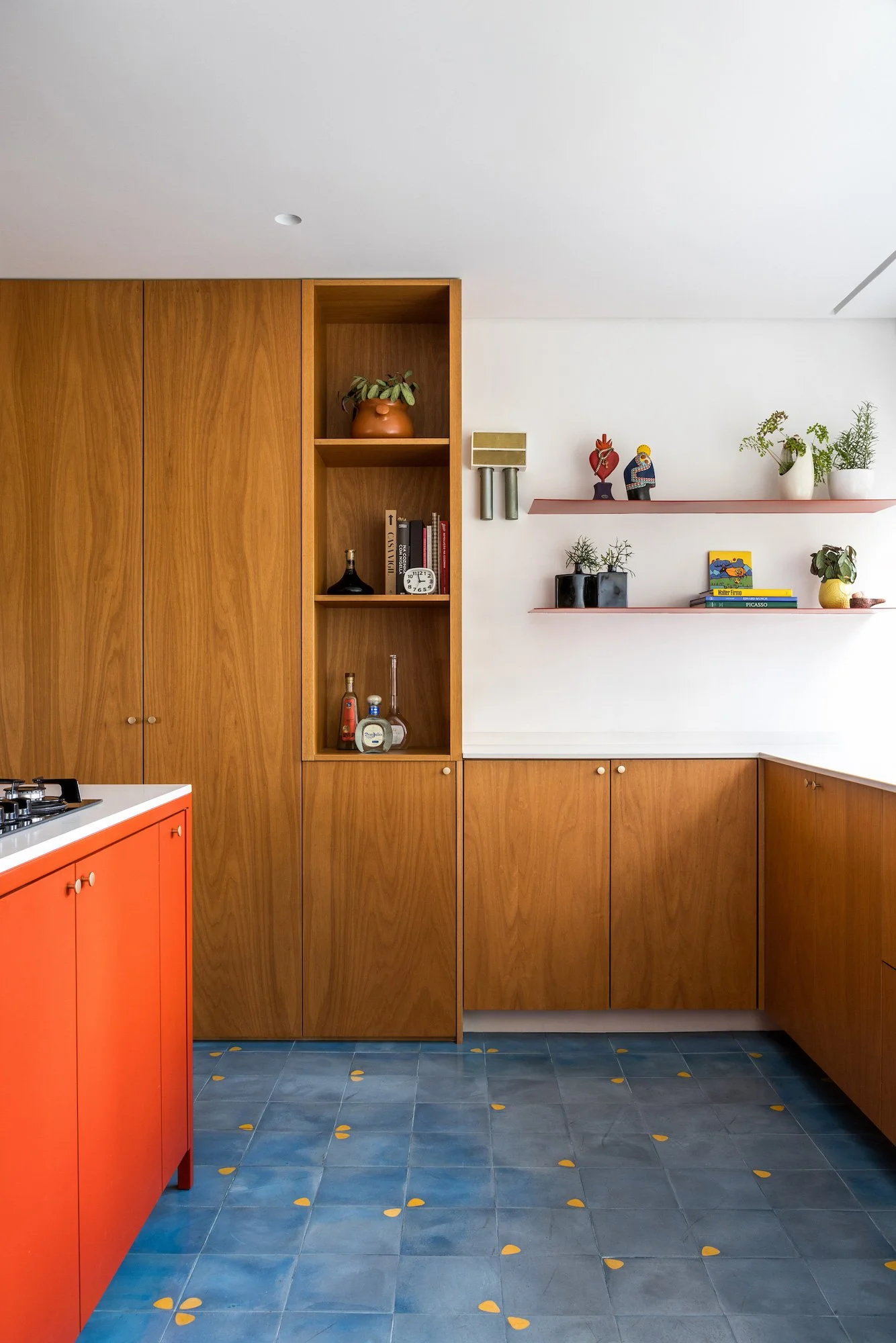
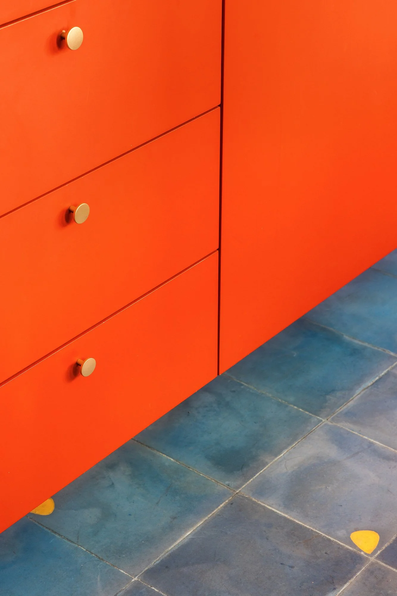
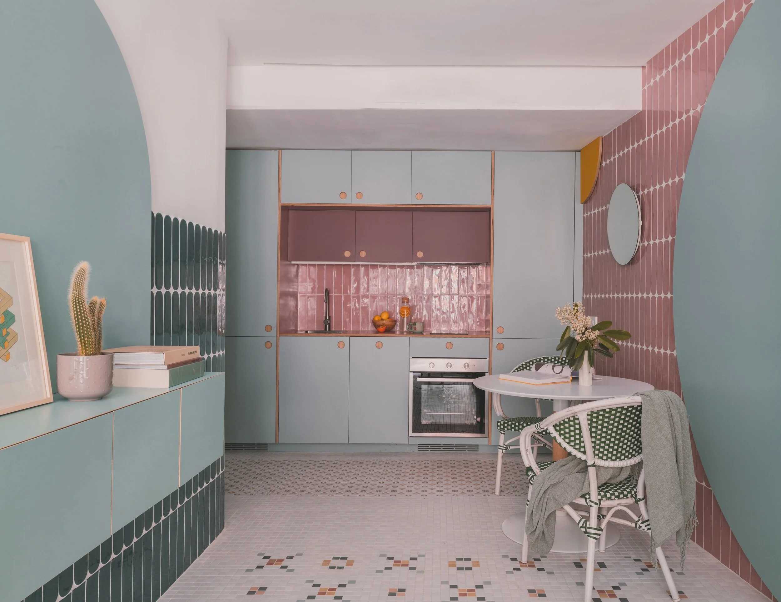
The kitchen combines blue hydraulic tiles and a red steel island, balanced by enveloping wood cabinetry that visually connects to the rest of the apartment.
The kitchen emerges as the project’s most vivid expression of contrast and identity. Blue hydraulic tiles ground the floor, introducing pattern and chromatic depth, while a red steel island punctuates the space with graphic clarity. Wood panelling and cabinetry wrap the perimeter, ensuring continuity with the adjacent social areas and preventing the bold palette from fragmenting the apartment visually. The kitchen feels energetic without being theatrical, designed to support both daily routines and informal gatherings with equal ease.
Throughout the apartment, material transitions are handled with restraint. Wood remains a unifying element, appearing across flooring, cabinetry, and built-in storage, while colour is deployed strategically to articulate zones rather than compete for attention. This approach echoes the principles of Brazilian modernist architecture, where warmth, material honesty, and livability take precedence over ornamentation.
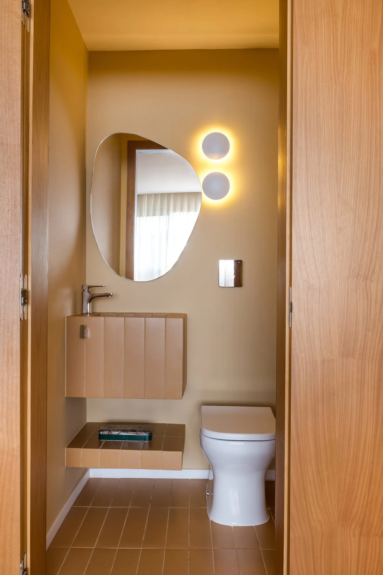
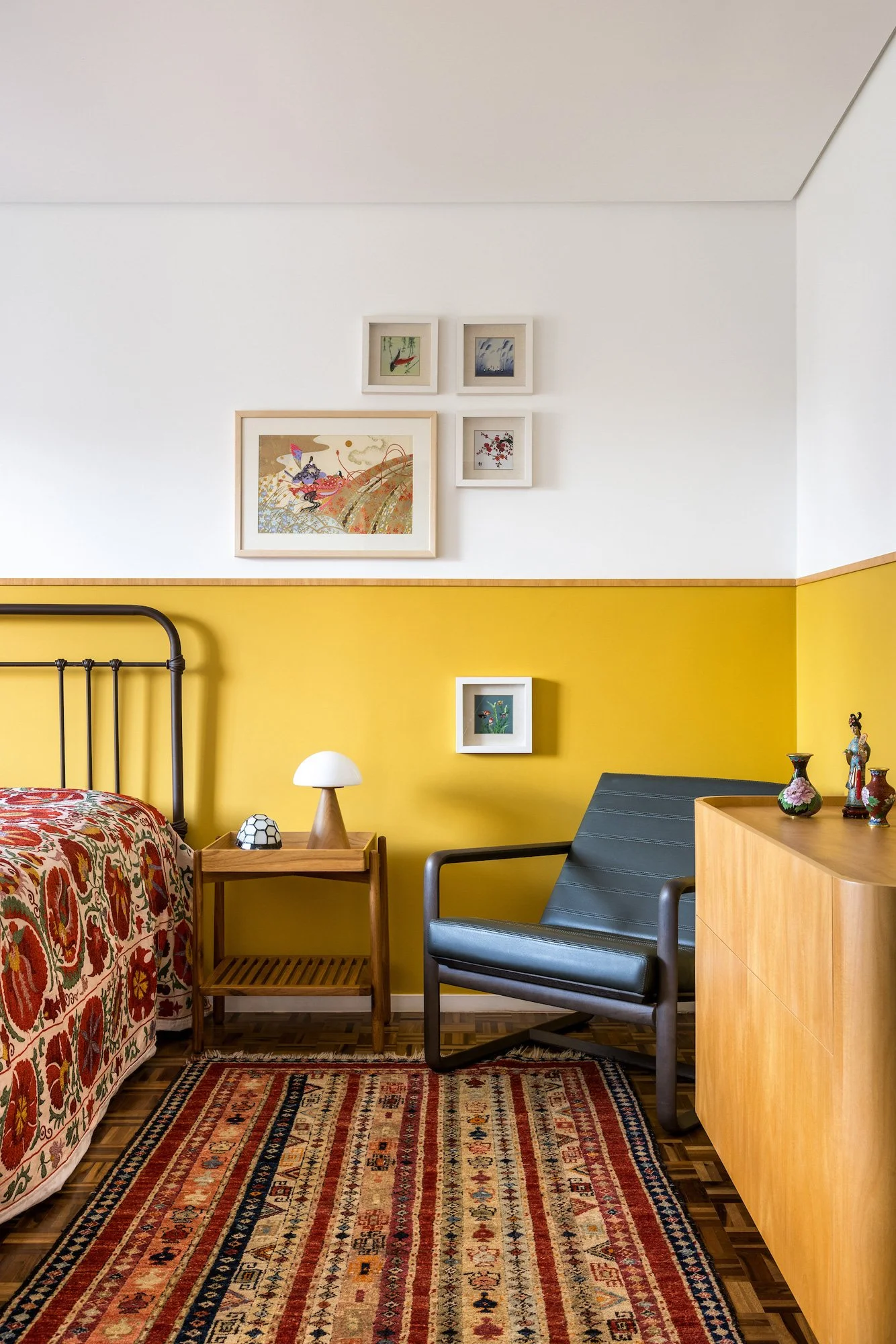
In the private areas, the same design logic continues. The master suite extends the palette of the social spaces, incorporating mustard-toned walls and hydraulic tiles in the bathroom. These choices create a sense of continuity while allowing the suite to retain its own atmosphere, one that feels intimate and grounded rather than decorative.
The second en-suite bedroom is designed with flexibility in mind, functioning primarily as a home office and adapting easily into a guest room when needed. This dual-purpose approach reflects a broader understanding of contemporary living, where spaces are expected to evolve alongside daily life.
Green hydraulic tiles wrap the bathroom, pairing graphic pattern with muted colour to create a space that feels grounded, calm, and tactile rather than decorative.
What distinguishes this Curitiba apartment is not the presence of colour, but the discipline behind its use. Each material and tone serves a clear purpose, contributing to an interior that feels cohesive, expressive, and deeply personal. It is a project that demonstrates how colour, when treated as a structural element, can shape identity without sacrificing calm, functionality, or longevity.